| Location | Loc | Population | MedianAgeMarriage | Marriage | Marriage SE | Divorce | Divorce SE | WaffleHouses | South | Slaves1860 | Population1860 | PropSlaves1860 |
|---|---|---|---|---|---|---|---|---|---|---|---|---|
| Alabama | AL | 4.78 | 25.3 | 20.2 | 1.27 | 12.7 | 0.79 | 128 | Southern State | 435080 | 964201 | 0.45 |
| Alaska | AK | 0.71 | 25.2 | 26.0 | 2.93 | 12.5 | 2.05 | 0 | Other State | 0 | 0 | 0.00 |
| Arizona | AZ | 6.33 | 25.8 | 20.3 | 0.98 | 10.8 | 0.74 | 18 | Other State | 0 | 0 | 0.00 |
| Arkansas | AR | 2.92 | 24.3 | 26.4 | 1.70 | 13.5 | 1.22 | 41 | Southern State | 111115 | 435450 | 0.26 |
| California | CA | 37.25 | 26.8 | 19.1 | 0.39 | 8.0 | 0.24 | 0 | Other State | 0 | 379994 | 0.00 |
| Colorado | CO | 5.03 | 25.7 | 23.5 | 1.24 | 11.6 | 0.94 | 11 | Other State | 0 | 34277 | 0.00 |
What to Expect When You’re Expecting MAT241
Overview
In this interactive page, we’ll explore a couple of data sets that Richard McElreath uses in his popular textbook, Statistical Rethinking. The wafflehouse data set includes state-by-state information including populations, marriage and divorce rates, counts of Waffle House restaurants, and more. The metal data set includes country level measurements on population, happiness, and number of metal bands originating from the corresponding country.
Don’t worry if you haven’t seen R before or even if you’ve never written a line of code in your entire life. The point here is to play and explore – we’ll learn R from the ground-up in our full course together.
The goals I have for this interactive page are to:
- show some of what is possible with R
- empower you to ask your own interesting questions about the
wafflehouseormetaldata sets - give you an opportunity to play with R code, making small changes to investigate questions that are of interest to you
I’ve set up this page to read in the data and draw a couple of pictures – feel free to mess around and make changes. Don’t worry about “breaking” something or writing/changing code that results in an error – you can always reset the code chunk with the reset button.
Let’s get started!
The code chunk below reads in both the wafflehouse and metal data sets from Dr. McElreath’s GitHub repository. Run it using the green, triangular, play button at the top-left of the code chunk. I added the print() statement at the bottom of the code chunk to make it easy to tell that you’ve run the code – without it, no notification is provided.
As I mentioned, don’t worry about breaking the page or writing code that doesn’t work. These things will happen – you’ll learn about how to use R to analyze data, draw pictures, and more over the course of our full semester together. For now, you might stick to changing the variables included in a plot, changing the plot type, or even just changing some colors – you can find different available plotting layers here. If you’d like to try something more adventurous…go for it!
Waffle House Data
Let’s take a look at the first few rows of the data set and inspect the variables available below.
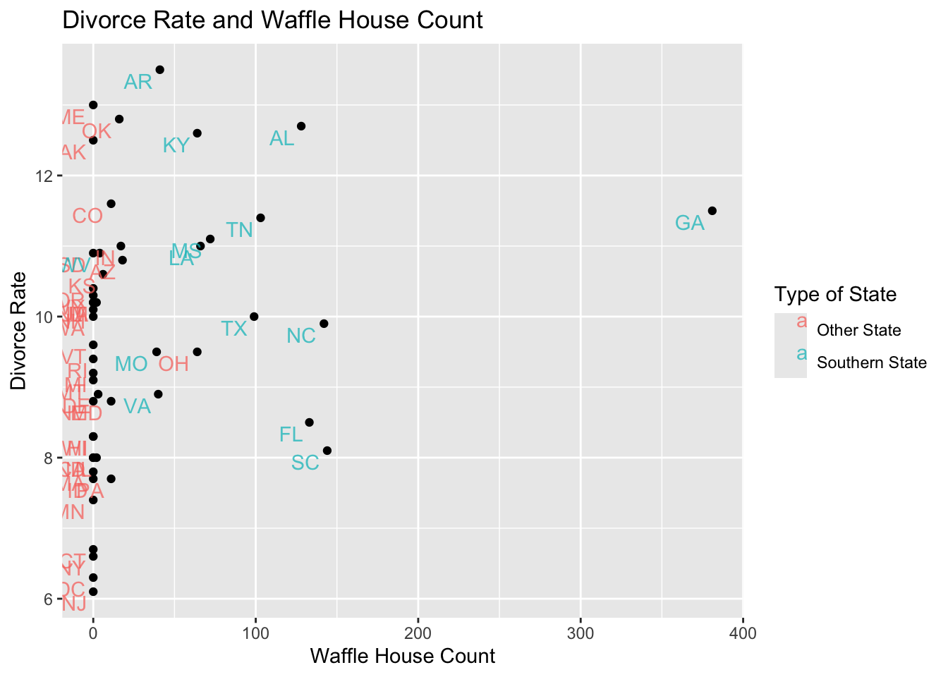
In McElreath’s text, he looks at the relationship between divorce rates and number of Waffle Houses per capita. The plot below examines divorce rates and raw Waffle House count.

The code to create the previous plot is pre-populated in the code chunk below. Complete each of the following to update the plot.
- Update the code to reproduce McElreath’s plot by replacing
x = WaffleHouseswithx = WaffleHouses/Population - Change the plot title and axis labels to more accurately describe your updated plot.
- Once you’ve updated the plot, think about what you are seeing and provide a description.
Making those changes above works because WaffleHouses and Population are both columns in the wafflehouse data frame (table).
Additional Waffle House Data Explorations
If you are finding this data set to be interesting, try making some additional explorations here! A great way to start is by copying and pasting the plotting code from the previous code chunk and making small changes to it. Are your results what you expected?
Metal and Happiness Data
Similar to the Waffle House data set, let’s begin by taking a look at the first few rows of the metal data frame and identifying the variables available to us.
| Territory | Bands | Population | Happiness |
|---|---|---|---|
| Afghanistan | 2 | 37466414 | 2.404 |
| Albania | 7 | 3088385 | 5.199 |
| Algeria | 16 | 43576691 | 5.122 |
| Andorra | 2 | 85645 | NA |
| Angola | 8 | 33642646 | NA |
| Argentina | 1907 | 45864941 | 5.967 |
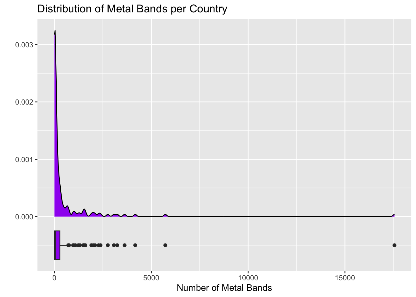
I wonder what the distribution of metal bands in a country is like! The plot below looks at the distribution of raw count of metal Bands per country. It includes two visualizations – a density plot and a boxplot.
Warning: Removed 29 rows containing non-finite outside the scale range
(`stat_density()`).
Warning: Removed 29 rows containing non-finite outside the scale range
(`stat_boxplot()`).
The plot above isn’t quite “fair” – why not? The code chunk below contains the code necessary to produce the plot above. Adjust the plot so that, rather than plotting raw metal band counts, you are plotting metal bands per capita. You can do this similarly to the way that you updated the Waffle House plot above. You’ll benefit by changing the y value and width on the boxplot to something around -1000 and 1000, respectively. Adjust the title and axis labels to fit this new plot as well.
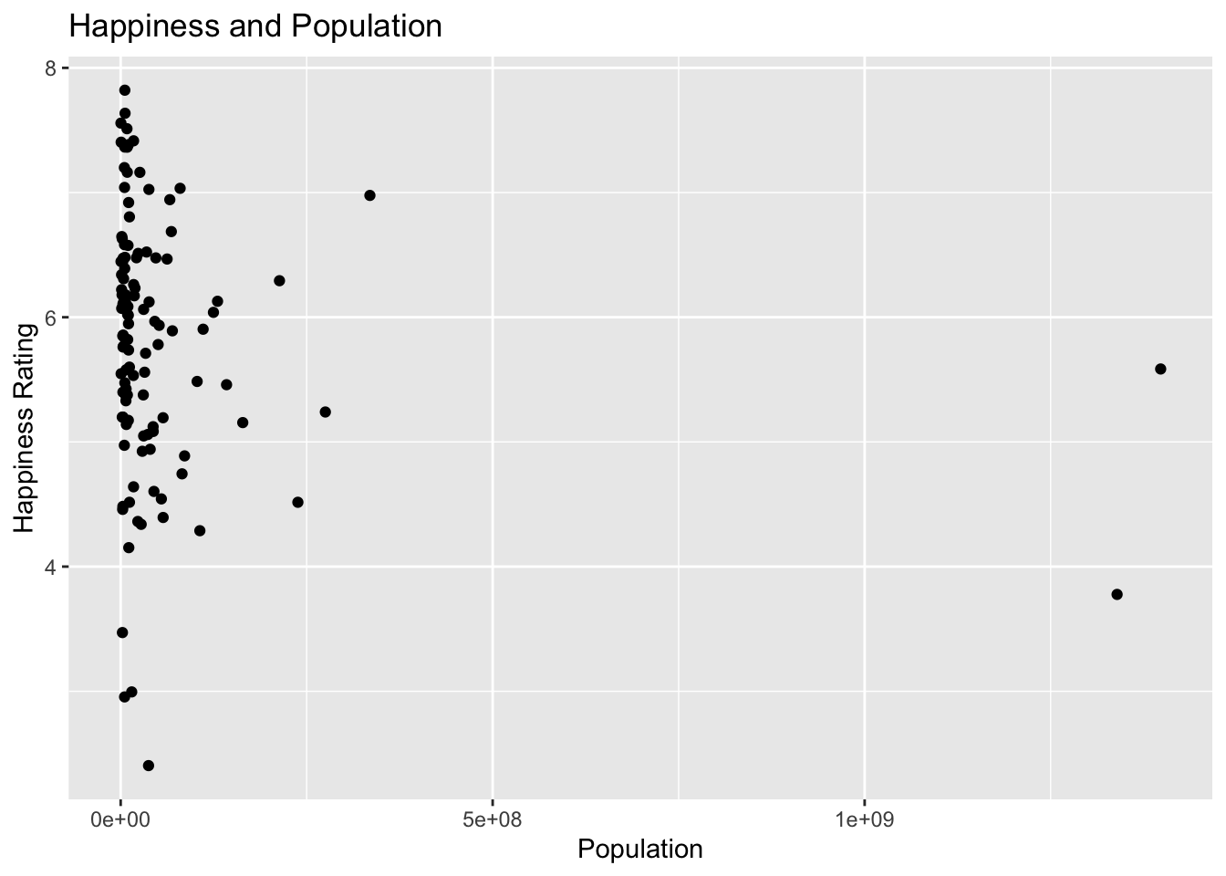
The Happiness column is an interesting one! I wonder if large countries are happy. The plot below is set up to answer this question.
metal %>%
  ggplot() +
  geom_point(aes(x = Population, y = Happiness)) +
  labs(title = "Happiness and Population",
       x = "Population",
       y = "Happiness Rating")
Warning: Removed 57 rows containing missing values or values outside the scale range
(`geom_point()`).
Now try plotting the Happiness against the number of metal bands per capita in the code cell below. What do you notice?
Additional Metal Explorations
If you found the metal data set interesting, feel free to include additional explorations below.
Summary
In this interactive page, we explored a couple of data sets and discovered some interesting findings! It is probably clear that these findings are coincidental, and that there are hidden variables which are driving the phenomena we saw. The field of statistics gives us the tools to determine whether phenomena are coincidental, present only in our observed sample data, or are likely to be indicative of a population-level insight/effect.
We’ll start our semester by learning how to describe observed sample data (descriptive statistics), and then move to using our observed sample data to better understand the populations that our samples are representative of (inferential statistics). Along the way, we’ll work with real data sets whenever possible, and we’ll learn about how we can use R to conduct our analyses. Don’t worry if the code from today was all brand new to you and you’re still confused by it – that’s expected and we’ll learn R “from the ground up” during our time together.
If you were able to do any of the following within this interactive page, then you are ahead of where I expected.
- Changed an axis label or plot title
- Changed the color of part of a plot
- Swapped out a variable used in a plot
If you experienced any of the following, then you are exactly where you should be.
- Thought – oh, that’s interesting…
- Wondered what if… or why…
- Wrote/changed code that didn’t work or didn’t do what you thought it would
Next Steps…
I hope you found this interactive page interesting and that you’ll consider enrolling in MAT241: Modern Statistics with Software. I’ll look forward to seeing you there!
References
[1] R. McElreath, Statistical Rethinking: A Bayesian Course with Examples in R and Stan, \(2^{nd}\) Edition, Chapman and Hall/CRC (2020)