Data Viz and ggplot() Intro
September 13, 2024
The Highlights
- Sample Viz
- Bad Viz
- Suggested Viz Choices
- Structure of a
ggplot() - Suggested Viz Choices, Revisited
- On Plot Labels
- Organizing plots with
{patchwork}
A Good Viz Tells a Clear Story

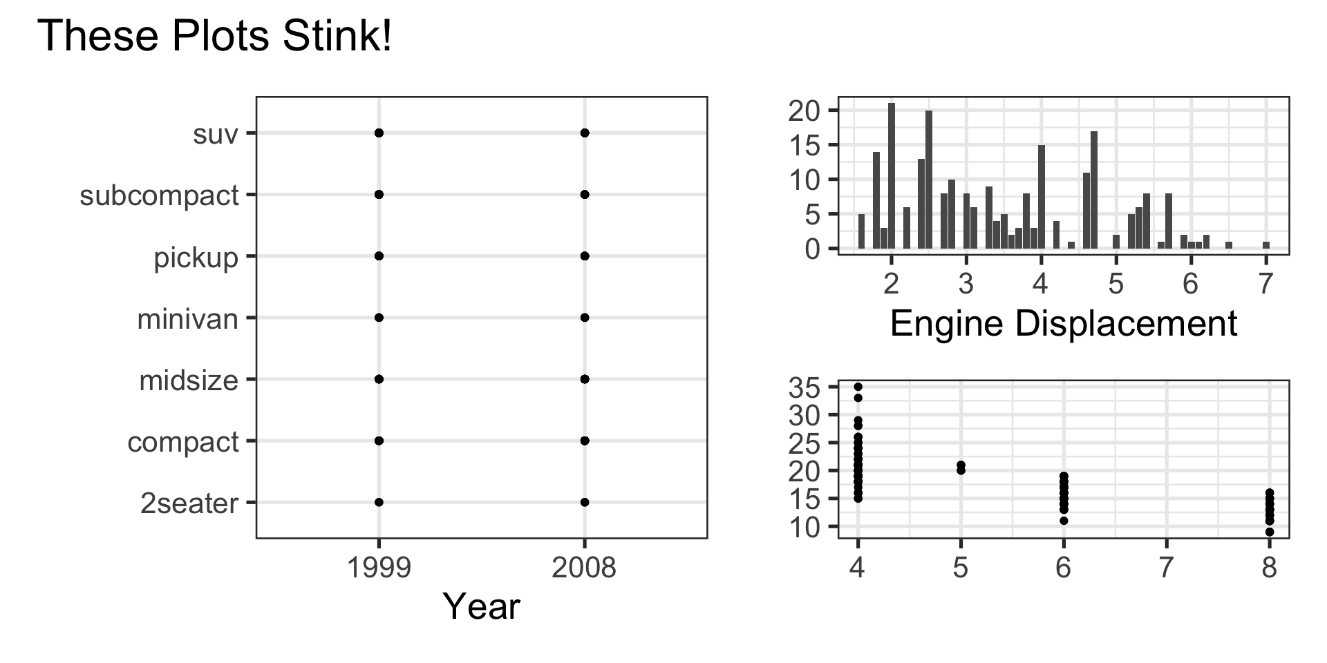
A Bad Viz Doesn’t
Suggested Viz Choices
Single Numerical Variable
- Histogram, Boxplot, or Density
Single Categorical Variable
- Bar Graph
Two Numerical Variables
- Scatterplot or Heatmap
Two Categorical Variables
- Bar Graph with Fill Color or Heatmap
One Numerical and One Categorical Variable
- Side-by-Side boxplots, overlayed or faceted histograms/densities
Structure of a ggplot()
Note we can pipe (
%>%) a data frame into a plot- We don’t need a data frame though
Once we use
ggplot()we use+to add layers instead of pipinggeom_*()layers require aesthetics to map variables to plot features- Different geoms have different required/permitted aesthetics
Can add multiple geoms to a single plot
Every plot should include labels
Let’s Do This!
Open RStudio
Check the top-right corner, next to the translucent blue box icon to verify that you are working in your
MAT300project space- If you see
Nonethere instead of your project name, open your project by navigating toFile -> Open Projector by using the dropdown menu near the project box
- If you see
Open your Quarto Notebook from last time
Add some questions that you think could be answered using a data visualization and describe the relevant viz type
Suggested Viz Choices, Revisited
Single Numerical Variable
geom_boxplot(),geom_histogram(), orgeom_density()- Require
xoryaesthetic (but not both!) - For example,
geom_density(aes(x = hwy))
- Require
Single Categorical Variable
geom_bar()- Requires
xoryaesthetic (but not both!) - For example,
geom_bar(aes(x = class))
- Requires
geom_col()- Can have both
xandyaesthetic - Example,
geom_col(aes(x = class, y = n))
- Can have both
Suggested Viz Choices, Revisited
Two Numerical Variables
geom_point()orgeom_hexbin()- Require both
xandyaesthetic - For example,
geom_point(aes(x = cty, y = hwy))
- Require both
Two Categorical Variables
geom_bar()- Use
xandfillaesthetics - For example,
geom_bar(aes(x = class, fill = drv))
- Use
Suggested Viz Choices, Revisited
One Numerical and One Categorical Variable
geom_boxplot()- Use both
xandyaesthetics - For example,
geom_boxplot(aes(x = hwy, y = class))
- Use both
geom_density()orgeom_histogram()- Use only
xaesthetic - Add layer
facet_wrap(~ VAR_NAME)
- Use only
Other available aesthetics include
color,size,shape, andalpha(transparency)- Remember, specific geoms permit only specific aesthetics
Try It!
\(\bigstar\) Now that you know about data visualization types, build basic plots to answer at least two of the questions you wrote out earlier
03:00
Try It!
\(\bigstar\) Now that you know about data visualization types, build basic plots to answer at least two of the questions you wrote out earlier
05:00
Try It!
\(\bigstar\) Now that you know about data visualization types, build basic plots to answer at least two of the questions you wrote out earlier
05:00
On Labels
The
labs()layer permits global plot labels and labels for any mapped aesthetictitlesubtitlecaptionalt(for alt-text)xycolorfill- etc.
Try It!
\(\bigstar\) Now that you know about labeling options in the labs() layer, update your plots with meaningful labels
05:00
Organizing Plots with {patchwork}
- Often you’ll want to arrange plots together, rather than printing them out one at a time
- The
{patchwork}package provides very easy and intuitive framework for doing this.
Create each of your plots, but store them into variables
p1,p2, …Use
+to organize plots side-by-side, and/to organize plots over/under one another.- For example,
(p1 + p2) / p3will arrange plotsp1andp2side-by-side, with plotp3underneath them.
- For example,
Try It!
\(\bigstar\) Use {patchwork} to experiment with different arrangements of your plots
05:00
Additional Practice
Ask at least four more questions that can be answered using data visualization
- At least one univiariate question and at least one multivariate question
- Add them to your notebook and describe why they are interesting questions
Construct relevant visuals (including meaningful labels) to answer your questions
- Experiment with plot arrangements using
{patchwork}if you like - Render your notebook to see the results when
{patchwork}is used versus when it is not - Decide what you like better in this case
- Experiment with plot arrangements using
Provide interpretations of the plots you are seeing
Reminder: You have a fully complete notebook using the penguins data on the class webpage.
In that notebook, I split the available data into training and testing sets – we’ll talk about why later on.
Next Time…
A Workshop Day on Quarto and R