Topic 4: Data Visualization and a Grammar of Graphics
About
This activity provides an introduction to the grammar of graphics, plotting strategies, and using ggplot. The discussion you’ll work through loosely follows Chapter 3 of Wickham and Grolemund’s R for Data Science. Here’s a link to the updated second edition of the text.
Note. The button above resets multiple choice and checkbox questions. Currently, resetting code cells must be done manually via hitting the Start Over button on each individual interactive cell.
Data Visualization
Through this workbook you’ll learn techniques for data visualization. You’ll think about how the type of plot chosen impacts what information is conveyed (or lost). Choosing the wrong plot type can result in a useless plot (at best) or even a plot which is misleading. Think about the types (numerical, categorical) of variables you are working with and how they dictate which plot type should be utilized – for example, a scatterplot is not appropriate in every scenario!
Objectives
Workbook Objectives: After completing this workbook you should be able to:
- Read a plot, describe any interesting features, and accurately convey the story being told by the plot.
- Identify and utilize the most appropriate plot types for your scenario by considering the types of variables you are working with.
- Utilize color, size, and shape to show additional dimensions of data in a plot, but also recognize that adding more information to a plot negatively impacts our ability to read the graphic.
- Use your new found knowledge of data visualization to generate informative plots which uncover a compelling (and truthful) story about the relationships that exist between variables.
Note, much of this notebook is inspired by Chapter 3 of R for Data Science by Hadley Wickham and Garrett Grolemund. This is a great freely-available resource. Please check it out.
The Grammar of Graphics
Grammar of Graphics: Jeffrey Gitomer said “Your grammar is a reflection of your image”. Here, we take the converse literally. Your image is a reflection of your grammar. Just like a well-written sentence follows the rules of grammar, so does an informative statistical graphic.
- Graphics need a subject (an underlying dataset)
- Graphics need verbs (a type of plotting structure, called a
geom) - Graphics need adjectives (attributes attached to the visualized data, called
aesthetics) - Graphics need context (a title, scales, axes, legends, etc.)
In this workbook we explore {ggplot2} and think about graphics in terms of their layered grammar.
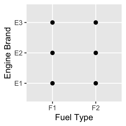
A Note on Plots: Choosing an appropriate plot is extremely important in data visualization. Some plots don’t make sense for certain variable types. For example, a scatterplot in the case of two-categorical predictors is quite a silly choice – the only thing this plot tells us is that every combination of fuel type and engine brand exists in our dataset. We have no idea which combinations are most or least popular.
The following are some recommended basic plot types under certain scenarios:
- A single numerical variable: a histogram, boxplot, or density plot
- A single categorical variable: a bar plot
- Numerical versus numerical: a scatterplot or heatmap
- Numerical versus categorical: side-by-side boxplots, stacked or overlaid densities, stacked or overlaid histograms
- Categorical versus categorical: bar plot with fill color, mosaic plot, heatmap
Check Your Understanding: A Better Plot
Which of the following plot types would have been a better choice to display the engine brand and fuel type data? Select all that apply.
Getting Started: Exploring Data
Throughout this workbook, we will explore fuel efficiencies of multiple classes of vehicles using the mpg data frame.
- Remember that a data frame is like an Excel spreadsheet. Explore the
mpgdata frame by typingmpgin the following code block and running it.
mpg
mpgNotice that when you execute a line of code which just calls the name of a data frame, a snippet of that data frame is printed out. This is true for other objects (variables, vectors, functions, etc) in R as well.
Some Basic Exploratory Functions: It is useful to know more about your dataset when you first start working with data. R has a few exploratory functions which you should know about: mpg |> names() prints out a list of names of your data frame’s columns, mpg |> head() will show you the first six rows of the mpg dataset, mpg |> dim() will show you the number of rows and columns in the dataset, and mpg |> glimpse() will show you information about how R is treating the columns (int and num denote numerical values while chr and fct represent character strings and categorical variables respectively). You might also try mpg |> skim(), where the skim() function comes from the {skimr} package. The skim() function provides lots of high-level information about your dataset from just a single function call. Use the code block below to try each of these functions and use the output to answer the following questions:
Hint 1
Try some of the functions listed above — names(), head(), dim(), glimpse(), and skim().
Hint 2
Fill in the blanks with the name of the data frame.
___ |> names()
___ |> head()
___ |> dim()
___ |> glimpse()
___ |> skim()
Hint 3 (Solved)
mpg |> names()
mpg |> head()
mpg |> dim()
mpg |> glimpse()
mpg |> skim()
Check Your Understanding: Variables
How many variables are contained in the mpg dataset?
Check Your Understanding: Observations
How many observations (records) are contained in the mpg dataset?
Check Your Understanding: Numerical Variables
Which of the variables is R interpreting as numerical? Select all that apply.
The diamonds data frame is also available to you. See if you can get your basic exploratory functions to help you answer the same questions about the diamonds dataset using the code block below.
Hint 1
Use some of the same functions you used to explore the mpg data frame in the previous code block — just swap out the name of the data frame.
Were you able to obtain the information you were looking for? Be sure to ask a question if not!
Building and Interpreting Plots
The code below creates a plot of highway miles per gallon (hwy) against engine displacement displ (a measure of the size of an engine).
mpg |>
  ggplot() +
  geom_point(aes(x = displ, y = hwy))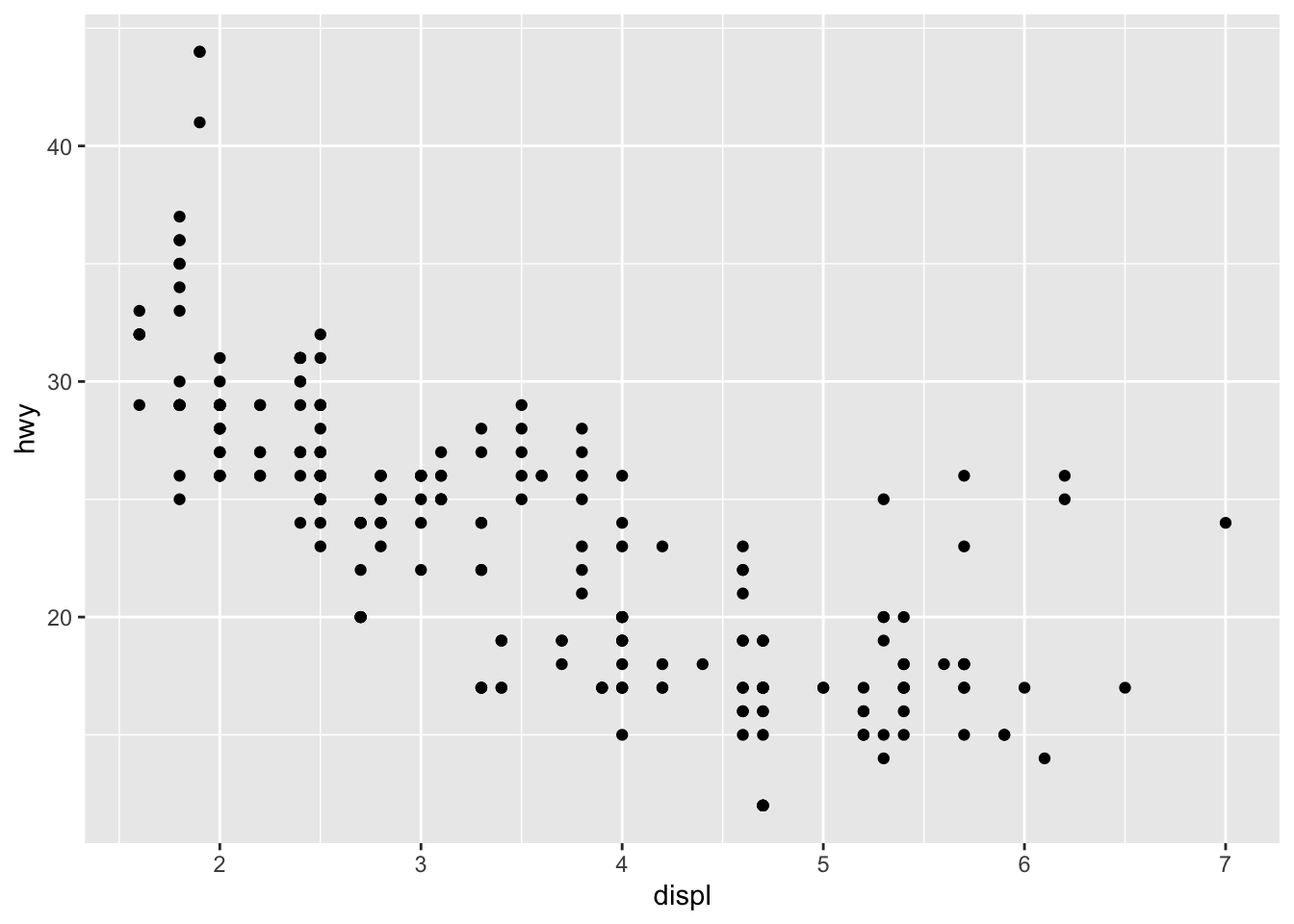
Use the plot above to answer the following questions.
Check Your Understanding: Reading a Plot I
Which of the following is true?
Check Your Understanding: Reading a Plot II
Describe the relationship between highway miles per gallon and engine displacement.
Check Your Understanding: Reading a Plot III
Which is the best practical interpretation of the plot?
A Note on Plotting Structure: Using ggplot() to create plots in R is daunting at first, but with practice you will notice the structure is very consistent and convenient!
- Our plot consists of at least two pieces (subject and verb):
mpg |> ggplot()tellsggplotthat the subject of our plot is the data contained in thempgtable, while thegeom_point()verb tellsggplotthat we want our data displayed as points (a scatterplot). Theaes()inside ofgeom_point()tellsggplotsome of the adjectives for each individual observation – here, just the location! - In general a simple plot takes the form below – (where the items in “ALL CAPS” are replaced by your data frame, desired geometry type, and aesthetic mappings).
DATA |>
  ggplot() +
  geom_TYPE(aes(MAPPINGS))
Use the code block below to make a scatterplot of average city miles per gallon (cty) explained by engine displacement (displ).
Hint 1
Start by copying and pasting the code from the plot at the start of this subsection.
Hint 2
mpg |>
  ggplot() +
  geom_point(aes(x = displ, y = hwy))
What needs to be changed here?
Hint 3 (Solved)
Swap out the hwy variable for the cty variable.
mpg |>
  ggplot() +
  geom_point(aes(x = displ, y = cty))
mpg |>
  ggplot() +
  geom_point(aes(x = displ, y = cty))
mpg |>
  ggplot() +
  geom_point(aes(x = displ, y = cty))
Now make a scatterplot of average highway miles per gallon (hwy) explained by number of cylinders (cyl).
Hint 1
Again, start by copying and pasting an earlier plot as a starting point.
Hint 2
What needs to be changed now?
mpg |>
  ggplot() +
  geom_point(aes(x = displ, y = cty))
Hint 3
Both of the aesthetic mappings need to be changed.
mpg |>
  ggplot() +
  geom_point(aes(x = ___, y = ___))
Hint 4 (Solved)
Put cylinders (cyl) on the x-axis and highway gas mileage (hwy) on the y-axis.
mpg |>
  ggplot() +
  geom_point(aes(x = cyl, y = hwy))
mpg |>
  ggplot() +
  geom_point(aes(x = cyl, y = hwy))
mpg |>
  ggplot() +
  geom_point(aes(x = cyl, y = hwy))
Notice that this plot isn’t very useful because the cylinders variable takes on very few levels. We may be better off if we treat cyl as if it were a categorical variable here. Check out some of the other geometry layers available to you in ggplot here. Try building a set of side-by-side boxplots. If you get an error, be sure to read it – R suspects that the plot produced wasn’t the one you wanted and provides a suggestion.
Hint 1
Continue copying and pasting an earlier plot as a starting point.
Hint 2
What needs to be changed here?
mpg |>
  ggplot() +
  geom_point(aes(x = cyl, y = hwy))
Hint 3
Swap geom_point() out with geom_boxplot() and generate the plot. Can you decode the warning message that appears?
Hint 4
R is considering both the x- and y-variables to be numeric. The warning message suggests adding a group parameter inside of the aes() function. Which variable should be mapped to group?
mpg |>
  ggplot() +
  geom_boxplot(aes(x = cyl, y = hwy, group = ___))
Hint 5 (Solved)
We want a boxplot for each cylinder “group.” Map cyl to the group aesthetic.
mpg |>
  ggplot() +
  geom_boxplot(aes(
    x = cyl,
    y = hwy,
    group = cyl))
mpg |>
  ggplot() +
  geom_boxplot(aes(
    x = cyl,
    y = hwy,
    group = cyl))
mpg |>
  ggplot() +
  geom_boxplot(aes(
    x = cyl,
    y = hwy,
    group = cyl))
Consider the variables for vehicle class (class) and drive type (drv) as you answer the following questions.
Check Your Understanding: Appropriate Plot Types I
Why would a scatterplot not be an appropriate visual to use with these two variables?
Check Your Understanding: Appropriate Plot Types II
Which of the following plot types would be appropriate for building a visual with the class and drive type variables? Select all that apply.
Use the code block below to make a useful plot of class using geom_bar() with the aesthetics x = class and fill = drv. Think about the plot you create – what does it tell you?
Hint 1
Starting from an earlier plot can take you a long way — look for the simplest one that’s closest to what you need.
Hint 2
Several things need to be changed. What are they?
mpg |>
  ggplot() +
  geom_point(aes(x = displ, y = hwy))
Hint 3
Four things to be updated: change the geometry layer to geom_bar(), map class to x, remove the y aesthetic (bar heights are determined by counts automatically), and map drv to fill.
mpg |>
  ggplot() +
  geom_point(aes(x = displ, y = hwy))
Hint 4 (Solved)
mpg |>
  ggplot() +
  geom_bar(aes(x = class, fill = drv))
mpg |>
  ggplot() +
  geom_bar(aes(x = class, fill = drv))
mpg |>
  ggplot() +
  geom_bar(aes(x = class, fill = drv))
Note: There are many different geom types, and different aesthetic properties which can be passed to geoms. We will see examples throughout the rest of this activity, but reading the entirety of Chapter 3 in Hadley Wickham’s R for Data Science would be a great start for those of you who are more interested in data visualization.
Plotting More Than Two Variables at Once
Let’s go back to our original plot of hwy versus displ. Maybe we want to color the points in the scatterplot according to the class of the vehicle. Add a third aesthetic, color = class, to the code below and re-run the plot.
Hint 1
Add color as a new aesthetic inside aes() and map the class variable to it.
Hint 2
Fill in the blank to map the class variable to the color aesthetic.
mpg |>
  ggplot() +
  geom_point(aes(
    x = displ,
    y = hwy,
    color = ___))
Hint 3 (Solved)
mpg |>
  ggplot() +
  geom_point(aes(
    x = displ,
    y = hwy,
    color = class))
mpg |>
  ggplot() +
  geom_point(aes(
    x = displ,
    y = hwy,
    color = class))
mpg |>
  ggplot() +
  geom_point(aes(
    x = displ,
    y = hwy,
    color = class))
There’s a lot going on here, and it is hard to read. Try copying the above plotting command, but appending facet_wrap(~ class, nrow = 2) as a new layer to the plot – notice that plot layers are added with the + symbol. Again, think about the resulting plot and how it compares to your previous colored plot.
Hint 1
New layers are added to ggplots with the + sign.
Hint 2
Fill in the blank with the facet_wrap() layer.
mpg |>
  ggplot() +
  geom_point(aes(
    x = displ,
    y = hwy,
    color = class)) +
  ___
Hint 3
Fill in the blank with the facet_wrap() layer. Check the prompt for how to use facet_wrap().
mpg |>
  ggplot() +
  geom_point(aes(
    x = displ,
    y = hwy,
    color = class)) +
  facet_wrap(___)
Hint 4
The blank after the tilde (~) inside of facet_wrap() identifies the column whose categories should each get their own plot panel.
mpg |>
  ggplot() +
  geom_point(aes(
    x = displ,
    y = hwy,
    color = class)) +
  facet_wrap(~___, nrow = 2)
Hint 5 (Solved)
We want an individual plot for each of the vehicle classes.
mpg |>
  ggplot() +
  geom_point(aes(
    x = displ,
    y = hwy,
    color = class)) +
  facet_wrap(~ class, nrow = 2)
mpg |>
  ggplot() +
  geom_point(aes(
    x = displ,
    y = hwy,
    color = class)) +
  facet_wrap(~ class, nrow = 2)
mpg |>
  ggplot() +
  geom_point(aes(
    x = displ,
    y = hwy,
    color = class)) +
  facet_wrap(~ class, nrow = 2)
Check Your Understanding: Investigating Arguments
What does setting the argument nrow = 2 do? Don’t guess – think about how you can determine what the nrow argument here does.
Categorical Variables
We’ve seen plots for categorical variables earlier in this workbook. Let’s revisit a barplot with fill, similar to the one we constructed between class and drv earlier and check two alternative plots which give different insights. We’ll explore the manual versus automatic transmissions.
mpg |>
count(trans)| trans | n |
|---|---|
| auto(av) | 5 |
| auto(l3) | 2 |
| auto(l4) | 83 |
| auto(l5) | 39 |
| auto(l6) | 6 |
| auto(s4) | 3 |
| auto(s5) | 3 |
| auto(s6) | 16 |
| manual(m5) | 58 |
| manual(m6) | 19 |
Unfortunately the trans variable contains more detailed transmission information than what we are after. Omitting the last four characters from levels in the trans column would leave us with the information we want. While this sort of data wrangling is beyond the scope of these notebooks (and you won’t be asked to do it on your own), I’ll still show you how we can remove those last four characters below.
We can achieve our objective using the str_sub() function – this function subsets a string. Again, you won’t need this function for our course but, because we’re using it here, I’ll explain how it works. The first argument is the name of the column whose strings we want to subset, the second argument is the position of the first character we’d like to keep and the third argument is the position of the final character we’d like to keep. Using a negative number here is shorthand for “from the end”. That is, we’d like to keep all of the characters starting with the first and stopping five characters from the end of the string.
Run the code below to see the plot.
From the plot above we can tell that there are about twice as many vehicles in our dataset with automatic transmissions as there are with manual transmissions. Create a similar plot below, which fills the bars by the drv variable. Include the same title and axis labels as the plot above has.
Hint 1
Copy and paste the plotting code above and use it as a starting point.
Hint 2
Do you remember how to add a fill aesthetic?
mpg |>
  mutate(trans2 = str_sub(trans, 1, -5)) |>
  ggplot() +
  geom_bar(aes(x = trans2)) +
  labs(x = "Transmission Type",
       y = "Count",
       title = "Distribution of Transmission Types")
Hint 3 (Solved)
Map the drive variable (drv) to the fill aesthetic inside aes().
mpg |>
  mutate(trans2 = str_sub(trans, 1, -5)) |>
  ggplot() +
  geom_bar(aes(x = trans2, fill = drv)) +
  labs(x = "Transmission Type",
       y = "Count",
       title = "Distribution of Transmission Types")
mpg |>
  mutate(trans2 = str_sub(trans, 1, -5)) |>
  ggplot() +
  geom_bar(aes(x = trans2, fill = drv)) +
  labs(x = "Transmission Type",
       y = "Count",
       title = "Distribution of Transmission Types")
mpg |>
  mutate(trans2 = str_sub(trans, 1, -5)) |>
  ggplot() +
  geom_bar(aes(x = trans2, fill = drv)) +
  labs(x = "Transmission Type",
       y = "Count",
       title = "Distribution of Transmission Types")
The problem now is the difficulty in comparing the proportions of drive types within each of these classes. We can fix this by using the position argument. Outside of aes() but still within geom_bar(), add an argument position = "fill" to the pre-built plot. You’ll need to include a comma after aes() since commas separate arguments. Think about what is gained and lost in this new plot.
Hint 1
Since we aren’t mapping a column of our data set to the position parameter, we add it outside of the aes() function.
Hint 2
Fill in the blank to set the position to "fill".
mpg |>
  mutate(trans2 = str_sub(trans, 1, -5)) |>
  ggplot() +
  geom_bar(aes(
    x = trans2,
    fill = drv),
    position = ___) +
  labs(x = "Transmission Type",
       y = "Count",
       title = "Distribution of Transmission Types")
Hint 3 (Solved)
mpg |>
  mutate(trans2 = str_sub(trans, 1, -5)) |>
  ggplot() +
  geom_bar(aes(
    x = trans2,
    fill = drv),
    position = "fill") +
  labs(x = "Transmission Type",
       y = "Count",
       title = "Distribution of Transmission Types")
mpg |>
  mutate(trans2 = str_sub(trans, 1, -5)) |>
  ggplot() +
  geom_bar(aes(
    x = trans2,
    fill = drv),
    position = "fill") +
  labs(x = "Transmission Type",
       y = "Count",
       title = "Distribution of Transmission Types")
mpg |>
  mutate(trans2 = str_sub(trans, 1, -5)) |>
  ggplot() +
  geom_bar(aes(
    x = trans2,
    fill = drv),
    position = "fill") +
  labs(x = "Transmission Type",
       y = "Count",
       title = "Distribution of Transmission Types")
Great! But the problem now is that we’ve lost the idea that there are more automatic vehicles than there are manual vehicles in this dataset. As a third option, we can consider a mosaic plot.
mpg |>
  mutate(trans2 = str_sub(trans, 1, -5)) |>
  ggplot() +
  geom_mosaic(aes(
    x = product(trans2),
    fill = drv)) +
  labs(x = "Transmission Type",
       y = "Drive Type",
       title = "")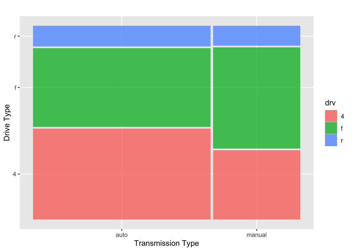
The advantage to the mosaic plot is that it contains all of the information from the two separate plots above, but it is all combined into one plot! We’ve built a visualization that manages to convey that the proportion of automatic vehicles in our data set outweighs the proportion of manuals, and we can also easily compare the distribution of drive types within each of these two classes.
Submit
If you are part of a course with an instructor who is grading your work on these activities, please copy and submit both of the hashes below using the method your instructor has requested.
Question Hash
The hash below encodes your responses to the multiple choice and checkbox questions in this activity.
Exercise Hash
Click the button below to generate your exercise submission code. This hash encodes your work on the graded code exercises in this activity.
You must have attempted the graded exercises before clicking — clicking generates a snapshot of your current results. If you have completed the activity over multiple sessions, please go back through and hit the Run Code button on each graded exercise before generating the hash below, to ensure your most recent results are recorded.
Summary
Main Takeaways
- Variable types dictate plot types. Always consider whether your variables are numerical or categorical before choosing a plot. A scatterplot requires two numerical variables; a histogram, boxplot, or density plot give insight to the distribution of a single numerical variable; a bar plot is appropriate for a single categorical variable and adding a fill color accommodates a second categorical variable; side-by-side boxplots work for numerical vs. categorical comparisons.
- Plotting with
ggplot()follows a grammar of graphics and a layered structure, with+separating each layer. The basic structure is:
data_frame_name |>
  ggplot() +
geom_TYPE(aes(MAPPINGS))- Aesthetics (
aes()) map variables from your data to visual properties of the plot (position, color, fill, size, shape). Properties that don’t depend on the data go outsideaes().- The plot type (geom type) determines which aesthetics are required and available.
- Additional dimensions can be added via color, fill, size, shape, or faceting — but more information in a single plot can make it harder to read. Sometimes separate faceted plots communicate more clearly than a single dense plot.
- Mosaic plots are a powerful choice for two categorical variables — they simultaneously convey both the marginal distributions and the conditional distributions within each group.
Looking Ahead
This activity concludes our foundational and “R-onramping” work. Over the next several workbooks, we’ll transition to probability and working with probability distributions. We’ll start with basic, counting-based probability before moving to the binomial distribution and normal distribution.
Loaded Libraries
These interactive workbooks allow setup requirements to be hidden so that we can focus on the task at hand — in this workbook, plotting. When you make the switch to using a standalone R instance you’ll need to install and load libraries to expand R’s functionality. You can do this with the install.packages() and library() functions. You would need {ggplot2}, {dplyr}, {skimr}, and {ggmosaic} to run the code for this workbook in a local R session.
References
[1] Wickham, H., & Grolemund, G. (2017). R for data science: Import, tidy, transform, visualize, and model data. O’Reilly Media. [2] Wickham, H. (2016). ggplot2: Elegant Graphics for Data Analysis. Springer-Verlag New York. [dataset]. https://ggplot2.tidyverse.org/reference/mpg.html