Data Viz and ggplot() Intro
January 2, 2026
The Highlights
- Sample Viz
- Bad Viz
- Suggested Viz Choices
- Structure of a
ggplot() - Suggested Viz Choices, Revisited
- On Plot Labels
- Organizing plots with
{patchwork}
A Good Viz Tells a Clear Story

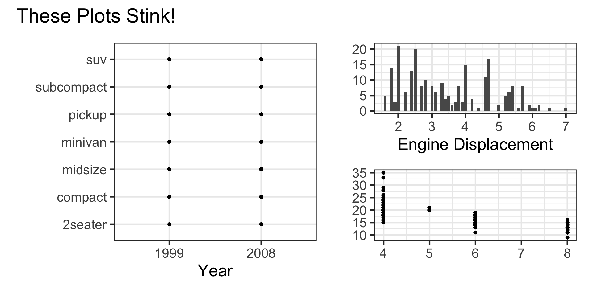
A Bad Viz Doesn’t
Suggested Viz Choices
Single Numerical Variable
- Histogram, Boxplot, or Density
Single Categorical Variable
- Bar Graph
Two Numerical Variables
- Scatterplot or Heatmap
Two Categorical Variables
- Bar Graph with Fill Color or Heatmap
One Numerical and One Categorical Variable
- Side-by-Side boxplots, overlayed or faceted histograms/densities
Let’s Do This!
- Open your MAT241 workspace Quarto document that we’ve been working within
- Navigate to the
Visualizing the Austin Zillow Datasubsection - Add the following questions to this data visualization section
- What is the average lot size?
- Is Austin the only city in the dataset?
- What is the distribution of price range?
- Is there an association between number of bedrooms and price range?
- Identify the most appropriate visual type(s) to investigate the questions above
- Identify and add some additional single- and multiple-variable questions to answer with plots
Structure of a ggplot()
Note we can pipe (
%>%) a data frame into a plot- We don’t need a data frame though
Once we use
ggplot()we use+to add layers instead of pipinggeom_*()layers require aesthetics to map variables to plot features- Different geoms have different required/permitted aesthetics
Can add multiple geoms to a single plot
Every plot should include labels
Suggested Viz Choices, Revisited
Single Numerical Variable
geom_boxplot(),geom_histogram(), orgeom_density()- Require
xoryaesthetic (but not both!) - For example,
geom_density(aes(x = hwy))
- Require
Single Categorical Variable
geom_bar()- Requires
xoryaesthetic (but not both!) - For example,
geom_bar(aes(x = class))
- Requires
geom_col()- Can have both
xandyaesthetic - Example,
geom_col(aes(x = class, y = n))
- Can have both
Suggested Viz Choices, Revisited
Two Numerical Variables
geom_point()orgeom_hexbin()- Require both
xandyaesthetic - For example,
geom_point(aes(x = cty, y = hwy))
- Require both
Two Categorical Variables
geom_bar()- Use
xandfillaesthetics - For example,
geom_bar(aes(x = class, fill = drv))
- Use
Suggested Viz Choices, Revisited
One Numerical and One Categorical Variable
geom_boxplot()- Use both
xandyaesthetics - For example,
geom_boxplot(aes(x = hwy, y = class))
- Use both
geom_density()orgeom_histogram()- Use only
xaesthetic - Add layer
facet_wrap(~ VAR_NAME)
- Use only
Other available aesthetics include
color,size,shape, andalpha(transparency)- Remember, specific geoms permit only specific aesthetics
Try It!
\(\bigstar\) Build plot(s) to help answer give us insight into the distribution of the lot size variable. If you’re successful (or if you just want to try something else), move on to plots that show the distribution of city or price range, or even to try building a plot to examine a potential association between number of bedrooms and price range. Take five minutes and then we’ll debrief together.
Try It!
\(\bigstar\) Use your knowledge of data visualization and ggplot to build basic plots to answer at least two of the questions you wrote out earlier. If you write broken code, troubleshoot with a neighbor, pull me over, or even post to Slack for help. See what you can do in a few minutes and then debrief together.
# r-coding-questions channel in Slack!
Try It!
\(\bigstar\) Use your knowledge of data visualization and ggplot to build basic plots to answer at least two of the questions you wrote out earlier. If you write broken code, troubleshoot with a neighbor, pull me over, or even post to Slack for help. We’ll see what we can do in a few minutes and then debrief together.
Made a plot you are proud of? Post it and the code to the # r-coding-questions channel in Slack!
On Labels
The
labs()layer permits global plot labels and labels for any mapped aesthetictitlesubtitlecaptionalt(for alt-text)xycolorfill- etc.
Try It!
\(\bigstar\) Now that you know about labeling options in the labs() layer, update your plots with meaningful labels
Organizing Plots with {patchwork}
- Often you’ll want to arrange plots together, rather than printing them out one at a time
- The
{patchwork}package provides very easy and intuitive framework for doing this.
Create each of your plots, but store them into variables
p1,p2, …Use
+to organize plots side-by-side, and/to organize plots over/under one another.- For example,
(p1 + p2) / p3will arrange plotsp1andp2side-by-side, with plotp3underneath them.
- For example,
Try It!
\(\bigstar\) Use {patchwork} to experiment with different arrangements of your plots
Additional Practice
Ask at several more questions that can be answered using data visualization
- At least one univiariate question and at least one multivariate question
- Add them to your notebook and describe why they are interesting questions
Construct relevant visuals (including meaningful labels) to answer your questions
- Experiment with plot arrangements using
{patchwork}if you like - Render your notebook to see the results when
{patchwork}is used versus when it is not - Decide what you like better in this case
- Experiment with plot arrangements using
Provide interpretations of the plots you are seeing
Exit Ticket Task
Navigate to our MAT241 Exit Ticket Form, answer the questions, and complete the task below.
Note. Today’s discussion is listed as 4. Data Visualization

Task: The content from the data visualization interactive notebook and this slide deck is difficult and coding heavy. You are not expected to be an expert. Do your best to describe what you might do to create a plot exploring whether an association exists between home type and the year the home was built. Discuss how the variables influence the appropriate plot type. You may also provide code or descriptions of layers using ggplot() terminology.
Next Time…
A Transition Into Probability